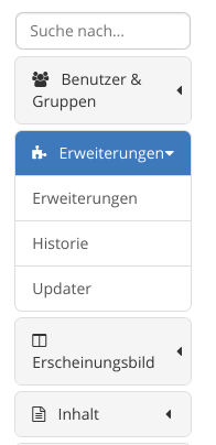
| When viewing the admin menu on a relatively narrow window, at least in the German translation, the spacing around the arrows is very inconsistent depending on the length of the text:
- At a certain text width, there is basically no spacing between the text and the arrow
- When there is a line break, the arrow is much closer to the right than when there is no line break.
I don't know if this is a recent change or not, I saw it on 16.4.1 but I suspect this is older. 
|