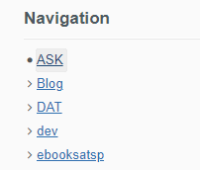
| When focusing an item in the Navigation panel ( and I'm pretty it's the same for other navigation trees...), the background of this item gets darker. With this darker background, the contrast minimums are not reached anymore.
 We should either make the :focus background lighter or the text when focused darker. This was initially spotted in an user audit. |