[xwiki-devs] [UX][Proposal] XWikiSyntax Page

Hi, This is a proposal for compacting the way we show XWiki Syntaxes http://incubator.myxwiki.org/xwiki/bin/view/Improvements/SyntaxExperiments Feedback is welcomed. Thanks, Caty

Hi Caty, On Nov 17, 2010, at 5:39 PM, Ecaterina Moraru (Valica) wrote:
Hi,
This is a proposal for compacting the way we show XWiki Syntaxes http://incubator.myxwiki.org/xwiki/bin/view/Improvements/SyntaxExperiments
Feedback is welcomed.
It looks good. I have some questions: * I think it would be good to have a menu on the left listing all the syntax "domains": text formatting, tables, sections, etc and when you click on "domains" you get the doc for that domain (without reloading the whole page if possible) * We need to ensure that this syntax help page is accessible for people with deficiencies (ie it must pass WCAG) since some of them won't be able to use the WYSIWYG editor they'll need to use the wiki editor and thus know how to write in wiki syntax. How could we make the syntax chooser work nicely for WCAG? Thanks -Vincent
On Wed, Nov 17, 2010 at 20:45, Vincent Massol <[email protected]> wrote:
Hi Caty,
On Nov 17, 2010, at 5:39 PM, Ecaterina Moraru (Valica) wrote:
Hi,
This is a proposal for compacting the way we show XWiki Syntaxes
http://incubator.myxwiki.org/xwiki/bin/view/Improvements/SyntaxExperiments
Feedback is welcomed.
It looks good.
I have some questions:
* I think it would be good to have a menu on the left listing all the syntax "domains": text formatting, tables, sections, etc and when you click on "domains" you get the doc for that domain (without reloading the whole page if possible)
I think this feature is already covered by the TOC. The main reasons I like it in the current form are: + the toc gives you a way to navigate to the desired section and this is accessible/visible since the beginning of the page. We could improve here by grouping into some categories (text editing, development, multimedia) and also using some numbers to show the hierarchy 1., 1.1, etc. (makes it much easier to follow the nesting) ; + if you want to browse the content, learn the syntax or just see XWiki syntax capabilities, is much easier to do this by scrolling than segmenting the content and needing to click each time. - the negative part about the current model is when you want to access two non-sequential categories: you either scroll until you find it, or go top and use another anchor. The generic solution for this problem (and this targets all pages, which is much nicer than building something custom just for the Syntax page) is the option to select to have a following TOC (the way we have now the page related action menu).
* We need to ensure that this syntax help page is accessible for people with deficiencies (ie it must pass WCAG) since some of them won't be able to use the WYSIWYG editor they'll need to use the wiki editor and thus know how to write in wiki syntax. How could we make the syntax chooser work nicely for WCAG?
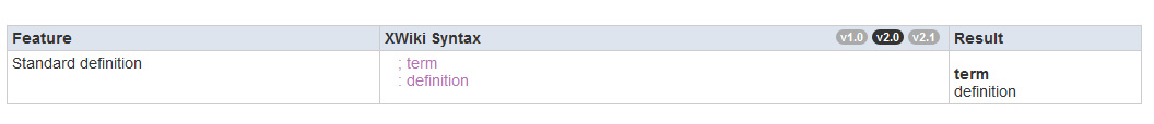
About WCAG: - the main problem with generated tables from wiki markup is that they lack summary attr. We can fix this by creating a macro that creates the table header, and we need one because the header will need to specify the syntaxes available for the specific feature (some features will be available just for syntax 2.0 and 2.1 for example). - we will improve the syntax chooser to conform with Link guidelines (will have underline, be marked as links and have title attr); - because of the comparison feature between syntaxes, various syntax code is mixed. For people that use screen readers will have hidden markup that will mark each line, and also have final total code written (not visible for the others), Example: <dt>term2</dt> :; term2 <dd>definition2</dd> :: definition2 will be marked: [Syntax 1.0] <dt>term2</dt> <dd>definition2</dd> [Syntax 2.0] :; term2 :: definition2 [Comparison] [Syntax 1.0] <dt>term2</dt> [Syntax 2.0] :; term2 [Syntax 1.0] <dd>definition2</dd> [Syntax 2.0] :: definition2 Please tell me if there are other WCAG problems. I will improve the proposal to show the hidden markup. Thanks, Caty
On Thu, Nov 18, 2010 at 12:40, Ecaterina Moraru (Valica) <[email protected]>wrote:
On Wed, Nov 17, 2010 at 20:45, Vincent Massol <[email protected]> wrote:
Hi Caty,
On Nov 17, 2010, at 5:39 PM, Ecaterina Moraru (Valica) wrote:
Hi,
This is a proposal for compacting the way we show XWiki Syntaxes
http://incubator.myxwiki.org/xwiki/bin/view/Improvements/SyntaxExperiments
Feedback is welcomed.
It looks good.
I have some questions:
* I think it would be good to have a menu on the left listing all the syntax "domains": text formatting, tables, sections, etc and when you click on "domains" you get the doc for that domain (without reloading the whole page if possible)
I think this feature is already covered by the TOC. The main reasons I like it in the current form are: + the toc gives you a way to navigate to the desired section and this is accessible/visible since the beginning of the page. We could improve here by grouping into some categories (text editing, development, multimedia) and also using some numbers to show the hierarchy 1., 1.1, etc. (makes it much easier to follow the nesting) ;
+ if you want to browse the content, learn the syntax or just see XWiki syntax capabilities, is much easier to do this by scrolling than segmenting the content and needing to click each time.
- the negative part about the current model is when you want to access two non-sequential categories: you either scroll until you find it, or go top and use another anchor. The generic solution for this problem (and this targets all pages, which is much nicer than building something custom just for the Syntax page) is the option to select to have a following TOC (the way we have now the page related action menu).
* We need to ensure that this syntax help page is accessible for people with deficiencies (ie it must pass WCAG) since some of them won't be able to use the WYSIWYG editor they'll need to use the wiki editor and thus know how to write in wiki syntax. How could we make the syntax chooser work nicely for WCAG?
About WCAG:
- the main problem with generated tables from wiki markup is that they lack summary attr. We can fix this by creating a macro that creates the table header, and we need one because the header will need to specify the syntaxes available for the specific feature (some features will be available just for syntax 2.0 and 2.1 for example).
- we will improve the syntax chooser to conform with Link guidelines (will have underline, be marked as links and have title attr);
- because of the comparison feature between syntaxes, various syntax code is mixed. For people that use screen readers will have hidden markup that will mark each line, and also have final total code written (not visible for the others), Example:
<dt>term2</dt> :; term2 <dd>definition2</dd> :: definition2
will be marked:
[Syntax 1.0] <dt>term2</dt> <dd>definition2</dd>
[Syntax 2.0] :; term2 :: definition2
[Comparison] [Syntax 1.0] <dt>term2</dt> [Syntax 2.0] :; term2 [Syntax 1.0] <dd>definition2</dd> [Syntax 2.0] :: definition2
Actually this is described at: http://www.w3.org/TR/WCAG20-TECHS/G14.html What we need to add is the active state for the syntax chooser, that is marked now using background-images bullets.
Please tell me if there are other WCAG problems. I will improve the proposal to show the hidden markup. Thanks, Caty
On Nov 18, 2010, at 11:40 AM, Ecaterina Moraru (Valica) wrote:
On Wed, Nov 17, 2010 at 20:45, Vincent Massol <[email protected]> wrote:
Hi Caty,
On Nov 17, 2010, at 5:39 PM, Ecaterina Moraru (Valica) wrote:
Hi,
This is a proposal for compacting the way we show XWiki Syntaxes
http://incubator.myxwiki.org/xwiki/bin/view/Improvements/SyntaxExperiments
Feedback is welcomed.
It looks good.
I have some questions:
* I think it would be good to have a menu on the left listing all the syntax "domains": text formatting, tables, sections, etc and when you click on "domains" you get the doc for that domain (without reloading the whole page if possible)
I think this feature is already covered by the TOC.
TOC is good but a nicer left menu is even better IMO. I'd envision something similar to the left menu in the new admin UI you've been working on. Note that it's not a big point and it could be done as a second step later on.
The main reasons I like it in the current form are: + the toc gives you a way to navigate to the desired section and this is accessible/visible since the beginning of the page. We could improve here by grouping into some categories (text editing, development, multimedia) and also using some numbers to show the hierarchy 1., 1.1, etc. (makes it much easier to follow the nesting) ;
+ if you want to browse the content, learn the syntax or just see XWiki syntax capabilities, is much easier to do this by scrolling than segmenting the content and needing to click each time.
Yes this is the part that I don't like too much. It makes the page look a bit huge and messy. However we could have the best of both worlds with something like: http://confluence.atlassian.com/renderer/notationhelp.action (check the ALL entry)
- the negative part about the current model is when you want to access two non-sequential categories: you either scroll until you find it, or go top and use another anchor.
Yes.
The generic solution for this problem (and this targets all pages, which is much nicer than building something custom just for the Syntax page) is the option to select to have a following TOC (the way we have now the page related action menu).
Or a panel on the left.
* We need to ensure that this syntax help page is accessible for people with deficiencies (ie it must pass WCAG) since some of them won't be able to use the WYSIWYG editor they'll need to use the wiki editor and thus know how to write in wiki syntax. How could we make the syntax chooser work nicely for WCAG?
About WCAG:
- the main problem with generated tables from wiki markup is that they lack summary attr. We can fix this by creating a macro that creates the table header, and we need one because the header will need to specify the syntaxes available for the specific feature (some features will be available just for syntax 2.0 and 2.1 for example).
- we will improve the syntax chooser to conform with Link guidelines (will have underline, be marked as links and have title attr);
- because of the comparison feature between syntaxes, various syntax code is mixed. For people that use screen readers will have hidden markup that will mark each line, and also have final total code written (not visible for the others), Example:
<dt>term2</dt> :; term2 <dd>definition2</dd> :: definition2
will be marked:
[Syntax 1.0] <dt>term2</dt> <dd>definition2</dd>
[Syntax 2.0] :; term2 :: definition2
[Comparison] [Syntax 1.0] <dt>term2</dt> [Syntax 2.0] :; term2 [Syntax 1.0] <dd>definition2</dd> [Syntax 2.0] :: definition2
Please tell me if there are other WCAG problems. I will improve the proposal to show the hidden markup.
ok thanks -Vincent

On 11/18/2010 12:56 PM, Vincent Massol wrote:
On Nov 18, 2010, at 11:40 AM, Ecaterina Moraru (Valica) wrote:
On Wed, Nov 17, 2010 at 20:45, Vincent Massol<[email protected]> wrote:
Hi Caty,
On Nov 17, 2010, at 5:39 PM, Ecaterina Moraru (Valica) wrote:
Hi,
This is a proposal for compacting the way we show XWiki Syntaxes
http://incubator.myxwiki.org/xwiki/bin/view/Improvements/SyntaxExperiments
Feedback is welcomed.
It looks good.
I have some questions:
* I think it would be good to have a menu on the left listing all the syntax "domains": text formatting, tables, sections, etc and when you click on "domains" you get the doc for that domain (without reloading the whole page if possible)
I think this feature is already covered by the TOC.
TOC is good but a nicer left menu is even better IMO. I'd envision something similar to the left menu in the new admin UI you've been working on. Note that it's not a big point and it could be done as a second step later on.
The main reasons I like it in the current form are: + the toc gives you a way to navigate to the desired section and this is accessible/visible since the beginning of the page. We could improve here by grouping into some categories (text editing, development, multimedia) and also using some numbers to show the hierarchy 1., 1.1, etc. (makes it much easier to follow the nesting) ;
+ if you want to browse the content, learn the syntax or just see XWiki syntax capabilities, is much easier to do this by scrolling than segmenting the content and needing to click each time.
Yes this is the part that I don't like too much. It makes the page look a bit huge and messy.
However we could have the best of both worlds with something like:
http://confluence.atlassian.com/renderer/notationhelp.action
Nice. This also shows that we don't need 3 columns. The information given by the "Feature" columns (which takes a lot of space) can be integrated in the other columns or moved outside of the table in a section title. I don't like the syntax chooser but I don't have a better solution (that scales with the number/version of syntaxes). For each non-default syntax I have to click twice to be able to copy&paste the example in my page. Thanks, Marius
(check the ALL entry)
- the negative part about the current model is when you want to access two non-sequential categories: you either scroll until you find it, or go top and use another anchor.
Yes.
The generic solution for this problem (and this targets all pages, which is much nicer than building something custom just for the Syntax page) is the option to select to have a following TOC (the way we have now the page related action menu).
Or a panel on the left.
* We need to ensure that this syntax help page is accessible for people with deficiencies (ie it must pass WCAG) since some of them won't be able to use the WYSIWYG editor they'll need to use the wiki editor and thus know how to write in wiki syntax. How could we make the syntax chooser work nicely for WCAG?
About WCAG:
- the main problem with generated tables from wiki markup is that they lack summary attr. We can fix this by creating a macro that creates the table header, and we need one because the header will need to specify the syntaxes available for the specific feature (some features will be available just for syntax 2.0 and 2.1 for example).
- we will improve the syntax chooser to conform with Link guidelines (will have underline, be marked as links and have title attr);
- because of the comparison feature between syntaxes, various syntax code is mixed. For people that use screen readers will have hidden markup that will mark each line, and also have final total code written (not visible for the others), Example:
<dt>term2</dt> :; term2 <dd>definition2</dd> :: definition2
will be marked:
[Syntax 1.0] <dt>term2</dt> <dd>definition2</dd>
[Syntax 2.0] :; term2 :: definition2
[Comparison] [Syntax 1.0]<dt>term2</dt> [Syntax 2.0] :; term2 [Syntax 1.0]<dd>definition2</dd> [Syntax 2.0] :: definition2
Please tell me if there are other WCAG problems. I will improve the proposal to show the hidden markup.
ok thanks -Vincent
_______________________________________________ devs mailing list [email protected] http://lists.xwiki.org/mailman/listinfo/devs

On 11/19/2010 08:44 AM, Marius Dumitru Florea wrote:
On 11/18/2010 12:56 PM, Vincent Massol wrote:
On Nov 18, 2010, at 11:40 AM, Ecaterina Moraru (Valica) wrote:
On Wed, Nov 17, 2010 at 20:45, Vincent Massol<[email protected]> wrote:
Hi Caty,
On Nov 17, 2010, at 5:39 PM, Ecaterina Moraru (Valica) wrote:
Hi,
This is a proposal for compacting the way we show XWiki Syntaxes
http://incubator.myxwiki.org/xwiki/bin/view/Improvements/SyntaxExperiments
Feedback is welcomed.
It looks good.
I have some questions:
* I think it would be good to have a menu on the left listing all the syntax "domains": text formatting, tables, sections, etc and when you click on "domains" you get the doc for that domain (without reloading the whole page if possible)
I think this feature is already covered by the TOC.
TOC is good but a nicer left menu is even better IMO. I'd envision something similar to the left menu in the new admin UI you've been working on. Note that it's not a big point and it could be done as a second step later on.
The main reasons I like it in the current form are: + the toc gives you a way to navigate to the desired section and this is accessible/visible since the beginning of the page. We could improve here by grouping into some categories (text editing, development, multimedia) and also using some numbers to show the hierarchy 1., 1.1, etc. (makes it much easier to follow the nesting) ;
+ if you want to browse the content, learn the syntax or just see XWiki syntax capabilities, is much easier to do this by scrolling than segmenting the content and needing to click each time.
Yes this is the part that I don't like too much. It makes the page look a bit huge and messy.
However we could have the best of both worlds with something like:
http://confluence.atlassian.com/renderer/notationhelp.action
Nice. This also shows that we don't need 3 columns. The information given by the "Feature" columns (which takes a lot of space) can be integrated in the other columns or moved outside of the table in a section title.
I don't like the syntax chooser but I don't have a better solution (that scales with the number/version of syntaxes). For each non-default syntax I have to click twice to be able to copy&paste the example in my page.
I agree. Also, it took me a while to understand how it works. I would have expected to work like tabs and switch to the clicked syntax only. At first it felt like random stuff being displayed, which I blamed on a potential bug in the mocked interaction. Also I wonder how does that scale... (if you have 7 syntaxes, it's gonna be a lot of strikedthrough text). I wonder if the benefits of the inline comparison (which are those, btw?) are bigger than the drawbacks of not understanding how it works and the amount of clicks needed to get the code. WDYT? Anca
Thanks, Marius
(check the ALL entry)
- the negative part about the current model is when you want to access two non-sequential categories: you either scroll until you find it, or go top and use another anchor.
Yes.
The generic solution for this problem (and this targets all pages, which is much nicer than building something custom just for the Syntax page) is the option to select to have a following TOC (the way we have now the page related action menu).
Or a panel on the left.
* We need to ensure that this syntax help page is accessible for people with deficiencies (ie it must pass WCAG) since some of them won't be able to use the WYSIWYG editor they'll need to use the wiki editor and thus know how to write in wiki syntax. How could we make the syntax chooser work nicely for WCAG?
About WCAG:
- the main problem with generated tables from wiki markup is that they lack summary attr. We can fix this by creating a macro that creates the table header, and we need one because the header will need to specify the syntaxes available for the specific feature (some features will be available just for syntax 2.0 and 2.1 for example).
- we will improve the syntax chooser to conform with Link guidelines (will have underline, be marked as links and have title attr);
- because of the comparison feature between syntaxes, various syntax code is mixed. For people that use screen readers will have hidden markup that will mark each line, and also have final total code written (not visible for the others), Example:
<dt>term2</dt> :; term2 <dd>definition2</dd> :: definition2
will be marked:
[Syntax 1.0] <dt>term2</dt> <dd>definition2</dd>
[Syntax 2.0] :; term2 :: definition2
[Comparison] [Syntax 1.0]<dt>term2</dt> [Syntax 2.0] :; term2 [Syntax 1.0]<dd>definition2</dd> [Syntax 2.0] :: definition2
Please tell me if there are other WCAG problems. I will improve the proposal to show the hidden markup.
ok thanks -Vincent
_______________________________________________ devs mailing list [email protected] http://lists.xwiki.org/mailman/listinfo/devs
devs mailing list [email protected] http://lists.xwiki.org/mailman/listinfo/devs

On Fri, Nov 19, 2010 at 10:06, Anca Luca <[email protected]> wrote:
On 11/19/2010 08:44 AM, Marius Dumitru Florea wrote:
On 11/18/2010 12:56 PM, Vincent Massol wrote:
On Nov 18, 2010, at 11:40 AM, Ecaterina Moraru (Valica) wrote:
On Wed, Nov 17, 2010 at 20:45, Vincent Massol<[email protected]> wrote:
Hi Caty,
On Nov 17, 2010, at 5:39 PM, Ecaterina Moraru (Valica) wrote:
Hi,
This is a proposal for compacting the way we show XWiki Syntaxes
http://incubator.myxwiki.org/xwiki/bin/view/Improvements/SyntaxExperiments
Feedback is welcomed.
It looks good.
I have some questions:
* I think it would be good to have a menu on the left listing all the syntax "domains": text formatting, tables, sections, etc and when you click on "domains" you get the doc for that domain (without reloading the whole page if possible)
I think this feature is already covered by the TOC.
TOC is good but a nicer left menu is even better IMO. I'd envision something similar to the left menu in the new admin UI you've been working on. Note that it's not a big point and it could be done as a second step later on.
The main reasons I like it in the current form are: + the toc gives you a way to navigate to the desired section and this is accessible/visible since the beginning of the page. We could improve here by grouping into some categories (text editing, development, multimedia) and also using some numbers to show the hierarchy 1., 1.1, etc. (makes it much easier to follow the nesting) ;
+ if you want to browse the content, learn the syntax or just see XWiki syntax capabilities, is much easier to do this by scrolling than segmenting the content and needing to click each time.
Yes this is the part that I don't like too much. It makes the page look a bit huge and messy.
However we could have the best of both worlds with something like:
http://confluence.atlassian.com/renderer/notationhelp.action
Nice. This also shows that we don't need 3 columns. The information given by the "Feature" columns (which takes a lot of space) can be integrated in the other columns or moved outside of the table in a section title.
I don't like the syntax chooser but I don't have a better solution (that scales with the number/version of syntaxes). For each non-default syntax I have to click twice to be able to copy&paste the example in my page.
I agree. Also, it took me a while to understand how it works. I would have expected to work like tabs and switch to the clicked syntax only. At first it felt like random stuff being displayed, which I blamed on a potential bug in the mocked interaction. Also I wonder how does that scale... (if you have 7 syntaxes, it's gonna be a lot of strikedthrough text).
I wonder if the benefits of the inline comparison (which are those, btw?) are bigger than the drawbacks of not understanding how it works and the amount of clicks needed to get the code.
I have a same doubt, it took me a while to understand how this was working. Choosen examples are not really good to see the benefit of this since comparing HTML and wiki syntax is pretty useless.
WDYT?
Anca
Thanks, Marius
(check the ALL entry)
- the negative part about the current model is when you want to access two non-sequential categories: you either scroll until you find it, or go top and use another anchor.
Yes.
The generic solution for this problem (and this targets all pages, which is much nicer than building something custom just for the Syntax page) is the option to select to have a following TOC (the way we have now the page related action menu).
Or a panel on the left.
* We need to ensure that this syntax help page is accessible for people with deficiencies (ie it must pass WCAG) since some of them won't be able to use the WYSIWYG editor they'll need to use the wiki editor and thus know how to write in wiki syntax. How could we make the syntax chooser work nicely for WCAG?
About WCAG:
- the main problem with generated tables from wiki markup is that they lack summary attr. We can fix this by creating a macro that creates the table header, and we need one because the header will need to specify the syntaxes available for the specific feature (some features will be available just for syntax 2.0 and 2.1 for example).
- we will improve the syntax chooser to conform with Link guidelines (will have underline, be marked as links and have title attr);
- because of the comparison feature between syntaxes, various syntax code is mixed. For people that use screen readers will have hidden markup that will mark each line, and also have final total code written (not visible for the others), Example:
<dt>term2</dt> :; term2 <dd>definition2</dd> :: definition2
will be marked:
[Syntax 1.0] <dt>term2</dt> <dd>definition2</dd>
[Syntax 2.0] :; term2 :: definition2
[Comparison] [Syntax 1.0]<dt>term2</dt> [Syntax 2.0] :; term2 [Syntax 1.0]<dd>definition2</dd> [Syntax 2.0] :: definition2
Please tell me if there are other WCAG problems. I will improve the proposal to show the hidden markup.
ok thanks -Vincent
_______________________________________________ devs mailing list [email protected] http://lists.xwiki.org/mailman/listinfo/devs
devs mailing list [email protected] http://lists.xwiki.org/mailman/listinfo/devs
_______________________________________________ devs mailing list [email protected] http://lists.xwiki.org/mailman/listinfo/devs
-- Thomas Mortagne

Hi, Pe 19.11.2010 11:06, Anca Luca a scris:
On 11/19/2010 08:44 AM, Marius Dumitru Florea wrote:
On 11/18/2010 12:56 PM, Vincent Massol wrote:
On Nov 18, 2010, at 11:40 AM, Ecaterina Moraru (Valica) wrote:
On Wed, Nov 17, 2010 at 20:45, Vincent Massol<[email protected]> wrote:
Hi Caty,
On Nov 17, 2010, at 5:39 PM, Ecaterina Moraru (Valica) wrote:
Hi,
This is a proposal for compacting the way we show XWiki Syntaxes
http://incubator.myxwiki.org/xwiki/bin/view/Improvements/SyntaxExperiments
Feedback is welcomed. It looks good.
I have some questions:
* I think it would be good to have a menu on the left listing all the syntax "domains": text formatting, tables, sections, etc and when you click on "domains" you get the doc for that domain (without reloading the whole page if possible)
I think this feature is already covered by the TOC. TOC is good but a nicer left menu is even better IMO. I'd envision something similar to the left menu in the new admin UI you've been working on. Note that it's not a big point and it could be done as a second step later on.
The main reasons I like it in the current form are: + the toc gives you a way to navigate to the desired section and this is accessible/visible since the beginning of the page. We could improve here by grouping into some categories (text editing, development, multimedia) and also using some numbers to show the hierarchy 1., 1.1, etc. (makes it much easier to follow the nesting) ;
+ if you want to browse the content, learn the syntax or just see XWiki syntax capabilities, is much easier to do this by scrolling than segmenting the content and needing to click each time. Yes this is the part that I don't like too much. It makes the page look a bit huge and messy.
However we could have the best of both worlds with something like: http://confluence.atlassian.com/renderer/notationhelp.action Nice. This also shows that we don't need 3 columns. The information given by the "Feature" columns (which takes a lot of space) can be integrated in the other columns or moved outside of the table in a section title.
I don't like the syntax chooser but I don't have a better solution (that scales with the number/version of syntaxes). For each non-default syntax I have to click twice to be able to copy&paste the example in my page. I agree. Also, it took me a while to understand how it works. I would have expected to work like tabs and switch to the clicked syntax only. At first it felt like random stuff being displayed, which I blamed on a potential bug in the mocked interaction. Also I wonder how does that scale... (if you have 7 syntaxes, it's gonna be a lot of strikedthrough text).
I wonder if the benefits of the inline comparison (which are those, btw?) are bigger than the drawbacks of not understanding how it works and the amount of clicks needed to get the code.
WDYT?
Anca
+1 I didn't understand immediately the current syntax. It took me a couple of minutes to figure it out. I believe this can be improved from a visual POV, however the issue of one too many clicks remains. I'd like to be able to view one syntax and after that click on another syntax (and see solely that) in order to copy content or even compare the different syntaxes. I find more value in spotting the differences by clicking on the syntaxes, rather than using the inline comparison, especially for big chunks of syntax & code. Taking into consideration making such a comparison implies going back and forth a few times, it can become annoying to select, select, deselect, select, deselect, select, deselect, etc. Thanks, Silvia
Thanks, Marius
(check the ALL entry)
- the negative part about the current model is when you want to access two non-sequential categories: you either scroll until you find it, or go top and use another anchor. Yes.
The generic solution for this problem (and this targets all pages, which is much nicer than building something custom just for the Syntax page) is the option to select to have a following TOC (the way we have now the page related action menu). Or a panel on the left.
* We need to ensure that this syntax help page is accessible for people with deficiencies (ie it must pass WCAG) since some of them won't be able to use the WYSIWYG editor they'll need to use the wiki editor and thus know how to write in wiki syntax. How could we make the syntax chooser work nicely for WCAG?
About WCAG:
- the main problem with generated tables from wiki markup is that they lack summary attr. We can fix this by creating a macro that creates the table header, and we need one because the header will need to specify the syntaxes available for the specific feature (some features will be available just for syntax 2.0 and 2.1 for example).
- we will improve the syntax chooser to conform with Link guidelines (will have underline, be marked as links and have title attr);
- because of the ison feature between syntaxes, various syntax code is mixed. For people that use screen readers will have hidden markup that will mark each line, and also have final total code written (not visible for the others), Example:
<dt>term2</dt> :; term2 <dd>definition2</dd> :: definition2
will be marked:
[Syntax 1.0] <dt>term2</dt> <dd>definition2</dd>
[Syntax 2.0] :; term2 :: definition2
[Comparison] [Syntax 1.0]<dt>term2</dt> [Syntax 2.0] :; term2 [Syntax 1.0]<dd>definition2</dd> [Syntax 2.0] :: definition2
Please tell me if there are other WCAG problems. I will improve the proposal to show the hidden markup. ok thanks -Vincent
_______________________________________________ devs mailing list [email protected] http://lists.xwiki.org/mailman/listinfo/devs
devs mailing list [email protected] http://lists.xwiki.org/mailman/listinfo/devs
devs mailing list [email protected] http://lists.xwiki.org/mailman/listinfo/devs

On Fri, Nov 19, 2010 at 8:44 AM, Marius Dumitru Florea <[email protected]> wrote:
Nice. This also shows that we don't need 3 columns. The information given by the "Feature" columns (which takes a lot of space) can be integrated in the other columns or moved outside of the table in a section title.
+1 to remove the 'Feature' column. Raluca.
I don't like the syntax chooser but I don't have a better solution (that scales with the number/version of syntaxes). For each non-default syntax I have to click twice to be able to copy&paste the example in my page.
Thanks, Marius
_______________________________________________ devs mailing list [email protected] http://lists.xwiki.org/mailman/listinfo/devs

Hi, Seems nice the way it is now, just details - I didn't test it, yet I have a doubt on the styling of the v1.0, v2.0 contrast for accessibility. - The comparaison feature which let activate both v1.0 and v2.0 may be too much. I've been lost on priting syntaxes myself. 1/ I had V2.0 activated http://screencast.com/t/mUfVjzP4M 2/ I wanted to see V2.0 3/ So I clicked on v2.0 4/ I saw stange crossed-out lines. http://screencast.com/t/Eybn7zsXW 5/ I feld confused 6/ I understood it was a sort of comparaison 7/ I tried to click on buttons, not understanding very well how to display it correctly 8/ I saw a Blank screen ! http://screencast.com/t/4xprQjLI9S 9/ I managed to have only V2.0 printed. http://screencast.com/t/wAi4kevro 10/ I understood how work the system (select one, select both, select neither) All of this took me approximatively 3s but it letted me confused. Would'nt it be simpler and most effective to have only a select one system ? I'm not sure the crossed out lines help a lot. Wich is needed is mostly global understanding of the syntaxe on this example. Have a nice day Thibaut DEVERAUX Tel : 06 75 51 20 80 [email protected] http://www.thib-d.com 2010/11/19 Raluca Stavro <[email protected]>
On Fri, Nov 19, 2010 at 8:44 AM, Marius Dumitru Florea <[email protected]> wrote:
Nice. This also shows that we don't need 3 columns. The information given by the "Feature" columns (which takes a lot of space) can be integrated in the other columns or moved outside of the table in a section title.
+1 to remove the 'Feature' column.
Raluca.
I don't like the syntax chooser but I don't have a better solution (that scales with the number/version of syntaxes). For each non-default syntax I have to click twice to be able to copy&paste the example in my page.
Thanks, Marius
_______________________________________________ devs mailing list [email protected] http://lists.xwiki.org/mailman/listinfo/devs
_______________________________________________ devs mailing list [email protected] http://lists.xwiki.org/mailman/listinfo/devs
Hello, The idea is very nice! What I would like to see is the text of the syntax versions (v1.0, v2.0, v2.1) being bigger and/or their colors being more intense. This way the user will figure out right away how many and what syntax versions XWiki provides and it will be easier for him to play with those syntax versions. I know that you chose those colors in order to look good on white background, this is why maybe a bold or a bigger text size would be better. Otherwise, it looks very good :) Raluca. On Wed, Nov 17, 2010 at 6:39 PM, Ecaterina Moraru (Valica) <[email protected]> wrote:
Hi,
This is a proposal for compacting the way we show XWiki Syntaxes http://incubator.myxwiki.org/xwiki/bin/view/Improvements/SyntaxExperiments
Feedback is welcomed.
Thanks, Caty _______________________________________________ devs mailing list [email protected] http://lists.xwiki.org/mailman/listinfo/devs
On Wed, Nov 17, 2010 at 21:03, Raluca Stavro <[email protected]>wrote:
Hello,
The idea is very nice! What I would like to see is the text of the syntax versions (v1.0, v2.0, v2.1) being bigger and/or their colors being more intense. This way the user will figure out right away how many and what syntax versions XWiki provides and it will be easier for him to play with those syntax versions.
I don't think this is the purpose of XWikiSyntax page, to see how many syntaxes we have and to play with them. The purpose is to understand how you can interact with the editor (by writing the correct syntax) in order to get what you want. IMO, working with an old syntax or trying an experimental one is not the main focus of most users. So changing the syntaxes is a secondary action and is targeted toward old users or devs . By default, the page will display the recommended/supported syntax (right now 2.0, this being also the default syntax when editing).
I know that you chose those colors in order to look good on white background, this is why maybe a bold or a bigger text size would be better. Otherwise, it looks very good :)
So, yes we can play with the colors but I wouldn't want to make the bolder or bigger in order to pop out. Thanks, Caty
Raluca.
On Wed, Nov 17, 2010 at 6:39 PM, Ecaterina Moraru (Valica) <[email protected]> wrote:
Hi,
This is a proposal for compacting the way we show XWiki Syntaxes
http://incubator.myxwiki.org/xwiki/bin/view/Improvements/SyntaxExperiments
Feedback is welcomed.
Thanks, Caty _______________________________________________ devs mailing list [email protected] http://lists.xwiki.org/mailman/listinfo/devs
_______________________________________________ devs mailing list [email protected] http://lists.xwiki.org/mailman/listinfo/devs
Hello, On Thu, Nov 18, 2010 at 11:57 AM, Ecaterina Moraru (Valica) <[email protected]> wrote:
On Wed, Nov 17, 2010 at 21:03, Raluca Stavro <[email protected]>wrote:
Hello,
The idea is very nice! What I would like to see is the text of the syntax versions (v1.0, v2.0, v2.1) being bigger and/or their colors being more intense. This way the user will figure out right away how many and what syntax versions XWiki provides and it will be easier for him to play with those syntax versions.
I don't think this is the purpose of XWikiSyntax page, to see how many syntaxes we have and to play with them. The purpose is to understand how you can interact with the editor (by writing the correct syntax) in order to get what you want. IMO, working with an old syntax or trying an experimental one is not the main focus of most users. So changing the syntax is a secondary action and is targeted toward old users or devs . True, but old users are important users and we want them to learn fast how to convert 1.0 syntax into 2.0 or 2.1 syntax. What would be the primer actions in this case? Even if an action is secondary, its text should be easy to read. Given the fact that the font size is small, maybe stronger color contrasts would help in order to increase readability.
By default, the page will display the recommended/supported syntax (right now 2.0, this being also the default syntax when editing).
I also think that the user should visually understand what is the default syntax displayed (2.0 in this case). Increasing the color contrast would probably solve this problem too. Raluca.
I know that you chose those colors in order to look good on white background, this is why maybe a bold or a bigger text size would be better. Otherwise, it looks very good :)
So, yes we can play with the colors but I wouldn't want to make the bolder or bigger in order to pop out.
Thanks, Caty
Raluca.
On Wed, Nov 17, 2010 at 6:39 PM, Ecaterina Moraru (Valica) <[email protected]> wrote:
Hi,
This is a proposal for compacting the way we show XWiki Syntaxes
http://incubator.myxwiki.org/xwiki/bin/view/Improvements/SyntaxExperiments
Feedback is welcomed.
Thanks, Caty _______________________________________________ devs mailing list [email protected] http://lists.xwiki.org/mailman/listinfo/devs
_______________________________________________ devs mailing list [email protected] http://lists.xwiki.org/mailman/listinfo/devs
_______________________________________________ devs mailing list [email protected] http://lists.xwiki.org/mailman/listinfo/devs

On 11/17/2010 09:03 PM, Raluca Stavro wrote:
Hello,
The idea is very nice! What I would like to see is the text of the syntax versions (v1.0, v2.0, v2.1) being bigger and/or their colors being more intense. This way the user will figure out right away how many and what syntax versions XWiki provides and it will be easier for him to play with those syntax versions. I know that you chose those colors in order to look good on white background, this is why maybe a bold or a bigger text size would be better. Otherwise, it looks very good :)
Raluca.
On Wed, Nov 17, 2010 at 6:39 PM, Ecaterina Moraru (Valica) <[email protected]> wrote:
Hi,
This is a proposal for compacting the way we show XWiki Syntaxes http://incubator.myxwiki.org/xwiki/bin/view/Improvements/SyntaxExperiments
Feedback is welcomed.
Hello This is a good alternative to our current syntax page. I am only worried about 2 things : 1.copy/paste is a bit faulty (as Marius said), but I guess this is just a bug in the prototype. 2.also, it would be a idea to have a global syntax button, so pressing it once, will switch all the syntaxes to a specific version. IMO, the point it to see the syntax user is interested in, not to make comparations between syntaxes. Besides these 2 things, +1. Regards, Sorin B.

Hi Caty, I suggest not to use different colors for syntax chooser buttons since some readability issues may occur when changing the background color of the table header. An idea would be to use different shades of gray for background as I tried in the attached image. Thanks Ciprian. On Wed, Nov 17, 2010 at 6:39 PM, Ecaterina Moraru (Valica) < [email protected]> wrote:
Hi,
This is a proposal for compacting the way we show XWiki Syntaxes http://incubator.myxwiki.org/xwiki/bin/view/Improvements/SyntaxExperiments
Feedback is welcomed.
Thanks, Caty _______________________________________________ devs mailing list [email protected] http://lists.xwiki.org/mailman/listinfo/devs
-- Ciprian, Designer XWiki
On Fri, Nov 19, 2010 at 13:57, Ciprian Amaritei <[email protected]> wrote:
Hi Caty, I suggest not to use different colors for syntax chooser buttons since some readability issues may occur when changing the background color of the table header. An idea would be to use different shades of gray for background as I tried in the attached image.
+1 for what i can see in the attached image
Thanks Ciprian.
On Wed, Nov 17, 2010 at 6:39 PM, Ecaterina Moraru (Valica) < [email protected]> wrote:
Hi,
This is a proposal for compacting the way we show XWiki Syntaxes http://incubator.myxwiki.org/xwiki/bin/view/Improvements/SyntaxExperiments
Feedback is welcomed.
Thanks, Caty _______________________________________________ devs mailing list [email protected] http://lists.xwiki.org/mailman/listinfo/devs
-- Ciprian, Designer XWiki
_______________________________________________ devs mailing list [email protected] http://lists.xwiki.org/mailman/listinfo/devs
-- Thomas Mortagne
Hello, On Fri, Nov 19, 2010 at 3:34 PM, Thomas Mortagne <[email protected]> wrote:
On Fri, Nov 19, 2010 at 13:57, Ciprian Amaritei <[email protected]> wrote:
Hi Caty, I suggest not to use different colors for syntax chooser buttons since some readability issues may occur when changing the background color of the table header. An idea would be to use different shades of gray for background as I tried in the attached image.
+1 for what i can see in the attached image
I would be +1 too, but what about the link between the syntax 'button' and the sample text? On having 2 syntax enabled, for example 1.0 and 2.0, if you go on another another page (new tab), when coming back to the syntax page, it will be hard for you to remember which one is 1.0 syntax and which one is 2.0 syntax. If we drop the idea of multiple syntax selection, then yes, your solution looks good. Raluca.
Thanks Ciprian.
On Wed, Nov 17, 2010 at 6:39 PM, Ecaterina Moraru (Valica) < [email protected]> wrote:
Hi,
This is a proposal for compacting the way we show XWiki Syntaxes http://incubator.myxwiki.org/xwiki/bin/view/Improvements/SyntaxExperiments
Feedback is welcomed.
Thanks, Caty _______________________________________________ devs mailing list [email protected] http://lists.xwiki.org/mailman/listinfo/devs
-- Ciprian, Designer XWiki
_______________________________________________ devs mailing list [email protected] http://lists.xwiki.org/mailman/listinfo/devs
-- Thomas Mortagne _______________________________________________ devs mailing list [email protected] http://lists.xwiki.org/mailman/listinfo/devs

On 11/19/2010 01:57 PM, Ciprian Amaritei wrote:
Hi Caty, I suggest not to use different colors for syntax chooser buttons since some readability issues may occur when changing the background color of the table header. An idea would be to use different shades of gray for background as I tried in the attached image.
Thanks Ciprian.
On Wed, Nov 17, 2010 at 6:39 PM, Ecaterina Moraru (Valica)< [email protected]> wrote:
Hi,
This is a proposal for compacting the way we show XWiki Syntaxes http://incubator.myxwiki.org/xwiki/bin/view/Improvements/SyntaxExperiments
Feedback is welcomed.
Personally I don't find it useful at all to be able to display more than one syntax at a time. On the contrary, it's confusing, with all the different colors and strike-through, and intermixed lines. Instead of a checkbox behavior, I'd like a radio button behavior. I'd also like a global syntax switcher, since users rarely want to look at mixed syntaxes. And this brings me to the main point, who is this page for, and how is it going to be used? I think that since this is a syntax help, most people will use it as a quick reference for the syntax they need to use at the moment, not as a comparison tool to check which of the syntaxes is the coolest. -- Sergiu Dumitriu http://purl.org/net/sergiu/
On Nov 21, 2010, at 11:59 AM, Sergiu Dumitriu wrote:
On 11/19/2010 01:57 PM, Ciprian Amaritei wrote:
Hi Caty, I suggest not to use different colors for syntax chooser buttons since some readability issues may occur when changing the background color of the table header. An idea would be to use different shades of gray for background as I tried in the attached image.
Thanks Ciprian.
On Wed, Nov 17, 2010 at 6:39 PM, Ecaterina Moraru (Valica)< [email protected]> wrote:
Hi,
This is a proposal for compacting the way we show XWiki Syntaxes http://incubator.myxwiki.org/xwiki/bin/view/Improvements/SyntaxExperiments
Feedback is welcomed.
Personally I don't find it useful at all to be able to display more than one syntax at a time. On the contrary, it's confusing, with all the different colors and strike-through, and intermixed lines. Instead of a checkbox behavior, I'd like a radio button behavior.
I'd also like a global syntax switcher, since users rarely want to look at mixed syntaxes.
That was my first reaction too.
And this brings me to the main point, who is this page for, and how is it going to be used?
It's the help page that you get when you click on help when in wiki edit mode.
I think that since this is a syntax help, most people will use it as a quick reference for the syntax they need to use at the moment, not as a comparison tool to check which of the syntaxes is the coolest.
I agree. Thanks -Vincent
Hi, Proposal 3 http://incubator.myxwiki.org/xwiki/bin/view/Improvements/SyntaxExperiments3 Thanks, Caty On Sun, Nov 21, 2010 at 14:35, Vincent Massol <[email protected]> wrote:
On Nov 21, 2010, at 11:59 AM, Sergiu Dumitriu wrote:
On 11/19/2010 01:57 PM, Ciprian Amaritei wrote:
Hi Caty, I suggest not to use different colors for syntax chooser buttons since some readability issues may occur when changing the background color of the table header. An idea would be to use different shades of gray for background as I tried in the attached image.
Thanks Ciprian.
On Wed, Nov 17, 2010 at 6:39 PM, Ecaterina Moraru (Valica)< [email protected]> wrote:
Hi,
This is a proposal for compacting the way we show XWiki Syntaxes
http://incubator.myxwiki.org/xwiki/bin/view/Improvements/SyntaxExperiments
Feedback is welcomed.
Personally I don't find it useful at all to be able to display more than one syntax at a time. On the contrary, it's confusing, with all the different colors and strike-through, and intermixed lines. Instead of a checkbox behavior, I'd like a radio button behavior.
I'd also like a global syntax switcher, since users rarely want to look at mixed syntaxes.
That was my first reaction too.
And this brings me to the main point, who is this page for, and how is it going to be used?
It's the help page that you get when you click on help when in wiki edit mode.
I think that since this is a syntax help, most people will use it as a quick reference for the syntax they need to use at the moment, not as a comparison tool to check which of the syntaxes is the coolest.
I agree.
Thanks -Vincent
_______________________________________________ devs mailing list [email protected] http://lists.xwiki.org/mailman/listinfo/devs
On 02/22/2011 03:26 PM, Ecaterina Moraru (Valica) wrote:
Hi,
Proposal 3 http://incubator.myxwiki.org/xwiki/bin/view/Improvements/SyntaxExperiments3
+1.
On Sun, Nov 21, 2010 at 14:35, Vincent Massol<[email protected]> wrote:
On Nov 21, 2010, at 11:59 AM, Sergiu Dumitriu wrote:
On 11/19/2010 01:57 PM, Ciprian Amaritei wrote:
Hi Caty, I suggest not to use different colors for syntax chooser buttons since some readability issues may occur when changing the background color of the table header. An idea would be to use different shades of gray for background as I tried in the attached image.
Thanks Ciprian.
On Wed, Nov 17, 2010 at 6:39 PM, Ecaterina Moraru (Valica)< [email protected]> wrote:
Hi,
This is a proposal for compacting the way we show XWiki Syntaxes
http://incubator.myxwiki.org/xwiki/bin/view/Improvements/SyntaxExperiments
Feedback is welcomed.
Personally I don't find it useful at all to be able to display more than one syntax at a time. On the contrary, it's confusing, with all the different colors and strike-through, and intermixed lines. Instead of a checkbox behavior, I'd like a radio button behavior.
I'd also like a global syntax switcher, since users rarely want to look at mixed syntaxes.
That was my first reaction too.
And this brings me to the main point, who is this page for, and how is it going to be used?
It's the help page that you get when you click on help when in wiki edit mode.
I think that since this is a syntax help, most people will use it as a quick reference for the syntax they need to use at the moment, not as a comparison tool to check which of the syntaxes is the coolest.
I agree.
Thanks -Vincent
-- Sergiu Dumitriu http://purl.org/net/sergiu/
On Tue, Feb 22, 2011 at 15:26, Ecaterina Moraru (Valica) <[email protected]> wrote:
Hi,
Proposal 3 http://incubator.myxwiki.org/xwiki/bin/view/Improvements/SyntaxExperiments3
I like it very much !
Thanks, Caty
On Sun, Nov 21, 2010 at 14:35, Vincent Massol <[email protected]> wrote:
On Nov 21, 2010, at 11:59 AM, Sergiu Dumitriu wrote:
On 11/19/2010 01:57 PM, Ciprian Amaritei wrote:
Hi Caty, I suggest not to use different colors for syntax chooser buttons since some readability issues may occur when changing the background color of the table header. An idea would be to use different shades of gray for background as I tried in the attached image.
Thanks Ciprian.
On Wed, Nov 17, 2010 at 6:39 PM, Ecaterina Moraru (Valica)< [email protected]> wrote:
Hi,
This is a proposal for compacting the way we show XWiki Syntaxes
http://incubator.myxwiki.org/xwiki/bin/view/Improvements/SyntaxExperiments
Feedback is welcomed.
Personally I don't find it useful at all to be able to display more than one syntax at a time. On the contrary, it's confusing, with all the different colors and strike-through, and intermixed lines. Instead of a checkbox behavior, I'd like a radio button behavior.
I'd also like a global syntax switcher, since users rarely want to look at mixed syntaxes.
That was my first reaction too.
And this brings me to the main point, who is this page for, and how is it going to be used?
It's the help page that you get when you click on help when in wiki edit mode.
I think that since this is a syntax help, most people will use it as a quick reference for the syntax they need to use at the moment, not as a comparison tool to check which of the syntaxes is the coolest.
I agree.
Thanks -Vincent
_______________________________________________ devs mailing list [email protected] http://lists.xwiki.org/mailman/listinfo/devs
_______________________________________________ devs mailing list [email protected] http://lists.xwiki.org/mailman/listinfo/devs
-- Thomas Mortagne
+1 Thanks, Marius On 02/22/2011 04:26 PM, Ecaterina Moraru (Valica) wrote:
Hi,
Proposal 3 http://incubator.myxwiki.org/xwiki/bin/view/Improvements/SyntaxExperiments3
Thanks, Caty
On Sun, Nov 21, 2010 at 14:35, Vincent Massol<[email protected]> wrote:
On Nov 21, 2010, at 11:59 AM, Sergiu Dumitriu wrote:
On 11/19/2010 01:57 PM, Ciprian Amaritei wrote:
Hi Caty, I suggest not to use different colors for syntax chooser buttons since some readability issues may occur when changing the background color of the table header. An idea would be to use different shades of gray for background as I tried in the attached image.
Thanks Ciprian.
On Wed, Nov 17, 2010 at 6:39 PM, Ecaterina Moraru (Valica)< [email protected]> wrote:
Hi,
This is a proposal for compacting the way we show XWiki Syntaxes
http://incubator.myxwiki.org/xwiki/bin/view/Improvements/SyntaxExperiments
Feedback is welcomed.
Personally I don't find it useful at all to be able to display more than one syntax at a time. On the contrary, it's confusing, with all the different colors and strike-through, and intermixed lines. Instead of a checkbox behavior, I'd like a radio button behavior.
I'd also like a global syntax switcher, since users rarely want to look at mixed syntaxes.
That was my first reaction too.
And this brings me to the main point, who is this page for, and how is it going to be used?
It's the help page that you get when you click on help when in wiki edit mode.
I think that since this is a syntax help, most people will use it as a quick reference for the syntax they need to use at the moment, not as a comparison tool to check which of the syntaxes is the coolest.
I agree.
Thanks -Vincent
_______________________________________________ devs mailing list [email protected] http://lists.xwiki.org/mailman/listinfo/devs
_______________________________________________ devs mailing list [email protected] http://lists.xwiki.org/mailman/listinfo/devs

+1 Jerome On Tue, Feb 22, 2011 at 5:44 PM, Marius Dumitru Florea <[email protected]> wrote:
+1
Thanks, Marius
On 02/22/2011 04:26 PM, Ecaterina Moraru (Valica) wrote:
Hi,
Proposal 3 http://incubator.myxwiki.org/xwiki/bin/view/Improvements/SyntaxExperiments3
Thanks, Caty
On Sun, Nov 21, 2010 at 14:35, Vincent Massol<[email protected]> wrote:
On Nov 21, 2010, at 11:59 AM, Sergiu Dumitriu wrote:
On 11/19/2010 01:57 PM, Ciprian Amaritei wrote:
Hi Caty, I suggest not to use different colors for syntax chooser buttons since some readability issues may occur when changing the background color of the table header. An idea would be to use different shades of gray for background as I tried in the attached image.
Thanks Ciprian.
On Wed, Nov 17, 2010 at 6:39 PM, Ecaterina Moraru (Valica)< [email protected]> wrote:
Hi,
This is a proposal for compacting the way we show XWiki Syntaxes
http://incubator.myxwiki.org/xwiki/bin/view/Improvements/SyntaxExperiments
Feedback is welcomed.
Personally I don't find it useful at all to be able to display more than one syntax at a time. On the contrary, it's confusing, with all the different colors and strike-through, and intermixed lines. Instead of a checkbox behavior, I'd like a radio button behavior.
I'd also like a global syntax switcher, since users rarely want to look at mixed syntaxes.
That was my first reaction too.
And this brings me to the main point, who is this page for, and how is it going to be used?
It's the help page that you get when you click on help when in wiki edit mode.
I think that since this is a syntax help, most people will use it as a quick reference for the syntax they need to use at the moment, not as a comparison tool to check which of the syntaxes is the coolest.
I agree.
Thanks -Vincent
_______________________________________________ devs mailing list [email protected] http://lists.xwiki.org/mailman/listinfo/devs
_______________________________________________ devs mailing list [email protected] http://lists.xwiki.org/mailman/listinfo/devs
devs mailing list [email protected] http://lists.xwiki.org/mailman/listinfo/devs

Definite +1 here. Just one question, did you split the content in three pages or how did you do it? Either way, if you give me code i can work with and a short explanation I can do the handy work. Also, is there a possibility to show all? Because vmassol and I discussed the issue a few days ago and he said an "All" category would be nice, which I second. -- View this message in context: http://xwiki.475771.n2.nabble.com/UX-Proposal-XWikiSyntax-Page-tp5748451p605... Sent from the XWiki- Dev mailing list archive at Nabble.com.
Ah, just read again, apparently there is a way to show all but that is only present before checking one of the categories. I think it would be nice to have an "All" category that is actually displayed and can be switched to in the left hand menu. -- View this message in context: http://xwiki.475771.n2.nabble.com/UX-Proposal-XWikiSyntax-Page-tp5748451p605... Sent from the XWiki- Dev mailing list archive at Nabble.com.
Hi, For the prototype I just hacked Administration (XWiki.AdminSheet) because it was more faster. In administration the content is divided in multiple pages that have a name convention. Also there is a the syntax separation that needs to be done (just like 'perSpace' attr). I am not the best person to give advices for coding this, maybe Sergiu can help. On Wed, Feb 23, 2011 at 09:30, jstoldt <[email protected]> wrote:
Ah, just read again, apparently there is a way to show all but that is only present before checking one of the categories. I think it would be nice to have an "All" category that is actually displayed and can be switched to in the left hand menu. --
When entering Administration you will see all the icons from every category. In the Syntax case this will be replaced with all the content from every category (that contains all the content from every section), so all the content will be there. This acts like the "ALL" filter so I don't think we need something separate for this. Thanks, Caty
View this message in context: http://xwiki.475771.n2.nabble.com/UX-Proposal-XWikiSyntax-Page-tp5748451p605... Sent from the XWiki- Dev mailing list archive at Nabble.com. _______________________________________________ devs mailing list [email protected] http://lists.xwiki.org/mailman/listinfo/devs
On 02/23/2011 10:25 AM, Ecaterina Moraru (Valica) wrote:
Hi,
For the prototype I just hacked Administration (XWiki.AdminSheet) because it was more faster. In administration the content is divided in multiple pages that have a name convention. Also there is a the syntax separation that needs to be done (just like 'perSpace' attr). I am not the best person to give advices for coding this, maybe Sergiu can help.
On Wed, Feb 23, 2011 at 09:30, jstoldt<[email protected]> wrote:
Ah, just read again, apparently there is a way to show all but that is only present before checking one of the categories. I think it would be nice to have an "All" category that is actually displayed and can be switched to in the left hand menu. --
When entering Administration you will see all the icons from every category. In the Syntax case this will be replaced with all the content from every category (that contains all the content from every section), so all the content will be there. This acts like the "ALL" filter so I don't think we need something separate for this.
I think it is useful to have a way to display again all the sections, besides reloading the syntax page. Thanks, Marius
Thanks, Caty
View this message in context: http://xwiki.475771.n2.nabble.com/UX-Proposal-XWikiSyntax-Page-tp5748451p605... Sent from the XWiki- Dev mailing list archive at Nabble.com. _______________________________________________ devs mailing list [email protected] http://lists.xwiki.org/mailman/listinfo/devs
_______________________________________________ devs mailing list [email protected] http://lists.xwiki.org/mailman/listinfo/devs
On Wed, Feb 23, 2011 at 10:46, Marius Dumitru Florea < [email protected]> wrote:
On 02/23/2011 10:25 AM, Ecaterina Moraru (Valica) wrote:
Hi,
For the prototype I just hacked Administration (XWiki.AdminSheet) because it was more faster. In administration the content is divided in multiple pages that have a name convention. Also there is a the syntax separation that needs to be done (just like 'perSpace' attr). I am not the best person to give advices for coding this, maybe Sergiu can help.
On Wed, Feb 23, 2011 at 09:30, jstoldt<[email protected]> wrote:
Ah, just read again, apparently there is a way to show all but that is
only
present before checking one of the categories. I think it would be nice to have an "All" category that is actually displayed and can be switched to in the left hand menu. --
When entering Administration you will see all the icons from every category. In the Syntax case this will be replaced with all the content from every category (that contains all the content from every section), so all the content will be there. This acts like the "ALL" filter so I don't think we need something separate for this.
I think it is useful to have a way to display again all the sections, besides reloading the syntax page.
you can use the breadcrumb "XWiki Syntax <http://localhost:8080/xwiki/bin/admin/XWiki/XWikiPreferences> » General<http://localhost:8080/xwiki/bin/admin/XWiki/XWikiPreferences?category=0> » Prerequisites" Thanks, Caty
Thanks, Marius
Thanks, Caty
View this message in context:
http://xwiki.475771.n2.nabble.com/UX-Proposal-XWikiSyntax-Page-tp5748451p605...
Sent from the XWiki- Dev mailing list archive at Nabble.com. _______________________________________________ devs mailing list [email protected] http://lists.xwiki.org/mailman/listinfo/devs
_______________________________________________ devs mailing list [email protected] http://lists.xwiki.org/mailman/listinfo/devs
devs mailing list [email protected] http://lists.xwiki.org/mailman/listinfo/devs
Hi, Very nice! +1 Silvia Pe 22.02.2011 16:26, Ecaterina Moraru (Valica) a scris:
Hi,
Proposal 3 http://incubator.myxwiki.org/xwiki/bin/view/Improvements/SyntaxExperiments3
Thanks, Caty
On Sun, Nov 21, 2010 at 14:35, Vincent Massol<[email protected]> wrote:
On Nov 21, 2010, at 11:59 AM, Sergiu Dumitriu wrote:
On 11/19/2010 01:57 PM, Ciprian Amaritei wrote:
Hi Caty, I suggest not to use different colors for syntax chooser buttons since some readability issues may occur when changing the background color of the table header. An idea would be to use different shades of gray for background as I tried in the attached image.
Thanks Ciprian.
On Wed, Nov 17, 2010 at 6:39 PM, Ecaterina Moraru (Valica)< [email protected]> wrote:
Hi,
This is a proposal for compacting the way we show XWiki Syntaxes
http://incubator.myxwiki.org/xwiki/bin/view/Improvements/SyntaxExperiments
Feedback is welcomed. Personally I don't find it useful at all to be able to display more than one syntax at a time. On the contrary, it's confusing, with all the different colors and strike-through, and intermixed lines. Instead of a checkbox behavior, I'd like a radio button behavior.
I'd also like a global syntax switcher, since users rarely want to look at mixed syntaxes. That was my first reaction too.
And this brings me to the main point, who is this page for, and how is it going to be used? It's the help page that you get when you click on help when in wiki edit mode.
I think that since this is a syntax help, most people will use it as a quick reference for the syntax they need to use at the moment, not as a comparison tool to check which of the syntaxes is the coolest. I agree.
Thanks -Vincent
_______________________________________________ devs mailing list [email protected] http://lists.xwiki.org/mailman/listinfo/devs
_______________________________________________ devs mailing list [email protected] http://lists.xwiki.org/mailman/listinfo/devs
+1 Regards, Sorin B.
Hi,
Proposal 3 http://incubator.myxwiki.org/xwiki/bin/view/Improvements/SyntaxExperiments3
Thanks, Caty
On Sun, Nov 21, 2010 at 14:35, Vincent Massol<[email protected]> wrote:
On Nov 21, 2010, at 11:59 AM, Sergiu Dumitriu wrote:
On 11/19/2010 01:57 PM, Ciprian Amaritei wrote:
Hi Caty, I suggest not to use different colors for syntax chooser buttons since some readability issues may occur when changing the background color of the table header. An idea would be to use different shades of gray for background as I tried in the attached image.
Thanks Ciprian.
On Wed, Nov 17, 2010 at 6:39 PM, Ecaterina Moraru (Valica)< [email protected]> wrote:
Hi,
This is a proposal for compacting the way we show XWiki Syntaxes
http://incubator.myxwiki.org/xwiki/bin/view/Improvements/SyntaxExperiments
Feedback is welcomed. Personally I don't find it useful at all to be able to display more than one syntax at a time. On the contrary, it's confusing, with all the different colors and strike-through, and intermixed lines. Instead of a checkbox behavior, I'd like a radio button behavior.
I'd also like a global syntax switcher, since users rarely want to look at mixed syntaxes. That was my first reaction too.
And this brings me to the main point, who is this page for, and how is it going to be used? It's the help page that you get when you click on help when in wiki edit mode.
I think that since this is a syntax help, most people will use it as a quick reference for the syntax they need to use at the moment, not as a comparison tool to check which of the syntaxes is the coolest. I agree.
Thanks -Vincent
_______________________________________________ devs mailing list [email protected] http://lists.xwiki.org/mailman/listinfo/devs
_______________________________________________ devs mailing list [email protected] http://lists.xwiki.org/mailman/listinfo/devs
Hello, +1 The proposal looks great, Caty! Raluca. On Tue, Feb 22, 2011 at 4:26 PM, Ecaterina Moraru (Valica) < [email protected]> wrote:
Hi,
Proposal 3 http://incubator.myxwiki.org/xwiki/bin/view/Improvements/SyntaxExperiments3
Thanks, Caty
On Sun, Nov 21, 2010 at 14:35, Vincent Massol <[email protected]> wrote:
On Nov 21, 2010, at 11:59 AM, Sergiu Dumitriu wrote:
On 11/19/2010 01:57 PM, Ciprian Amaritei wrote:
Hi Caty, I suggest not to use different colors for syntax chooser buttons since some readability issues may occur when changing the background color of the table header. An idea would be to use different shades of gray for
background
as I
tried in the attached image.
Thanks Ciprian.
On Wed, Nov 17, 2010 at 6:39 PM, Ecaterina Moraru (Valica)< [email protected]> wrote:
Hi,
This is a proposal for compacting the way we show XWiki Syntaxes
http://incubator.myxwiki.org/xwiki/bin/view/Improvements/SyntaxExperiments
Feedback is welcomed.
Personally I don't find it useful at all to be able to display more than one syntax at a time. On the contrary, it's confusing, with all the different colors and strike-through, and intermixed lines. Instead of a checkbox behavior, I'd like a radio button behavior.
I'd also like a global syntax switcher, since users rarely want to look at mixed syntaxes.
That was my first reaction too.
And this brings me to the main point, who is this page for, and how is it going to be used?
It's the help page that you get when you click on help when in wiki edit mode.
I think that since this is a syntax help, most people will use it as a quick reference for the syntax they need to use at the moment, not as a comparison tool to check which of the syntaxes is the coolest.
I agree.
Thanks -Vincent
_______________________________________________ devs mailing list [email protected] http://lists.xwiki.org/mailman/listinfo/devs
_______________________________________________ devs mailing list [email protected] http://lists.xwiki.org/mailman/listinfo/devs
participants (13)
-
 Anca Luca
 -
 Ciprian Amaritei
 -
 Ecaterina Moraru (Valica)
 -
 Jerome Velociter
 -
 jstoldt
 -
 Marius Dumitru Florea
 -
 Raluca Stavro
 -
 Sergiu Dumitriu
 -
 Silvia Rusu
 -
 Sorin Burjan
 -
 Thibaut DEVERAUX
 -
 Thomas Mortagne
 -
 Vincent Massol