
21 Oct
2014
21 Oct
'14
6:28 p.m.
Hi all,
I kind of liked this solution as well, I think, I sort of ended up getting
used to it. Indeed maybe the button needs to be more obviously a button.
The big disadvantage of hover is that people don't realise that the menu is
clickable by itself. I have seen a lot of users trying to choose something
from the submenu, not even trying to click on the top of the menu because
they don't realize the menu is clickable itself as well. This is also valid
for the edit menu, but a bit less bothering because regular users in
general don't have a submenu for the edit menu.
So, if I was to choose now, then maybe the 6.2.1 version would be "the
one", but with an improvement of the arrow to make it look more like an
extra clickable button to unpack more options.
Also, maybe a combination of the 2: clickable menu and an extra option to
go to the space in the menu if the user unpacks it.
I would be curious of Vincent's experience, which started this change in
the first place (the fact that people don't figure out that they can unpack
the menu or that they click the whole item to unpack the menu).
Thanks,
Anca
On Tue, Oct 21, 2014 at 3:43 PM, Guillaume Lerouge <guillaume(a)xwiki.com>
wrote:
Hi,
on this topic, I liked this intermediary solution a lot for the desktop
mode:
- *Nothing happening on hover*
- I actually think removing the on hover behavior is great in the top
bar
- I've seen it generate confusion / frustration in the wild,
especially when there's a menu, (for which on hover behavior makes
sense)
underneath
- *Entity name is a link to the wiki home / space home / page*
- *Clicking on the arrow button displays the menu*
- Maybe the actual issue is to make the arrow more prominent as a
clickable button?
Thanks,
Guillaume
On Tue, Oct 21, 2014 at 11:33 AM, vincent(a)massol.net <vincent(a)massol.net>
wrote:
fact
easily
mobile
"New"
see
enygma2002(a)gmail.com
same
top
at
mode,
add a
button
a
and
so
to
to
don’t
expecting
http://design.xwiki.org/xwiki/bin/download/Proposal/InterfaceAndContentLang…
is
few
https://www.evernote.com/shard/s119/sh/20e99ab3-2991-4aa8-a7b5-93088aad4944…
would
implement
it
list
_______________________________________________
devs mailing list
devs(a)xwiki.org
http://lists.xwiki.org/mailman/listinfo/devs
It's hard to disagree with this and I also
agree it would be a pity to
have a suboptimal desktop experience because of touch devices :)
Remaining questions:
* How much work is it to maintain 2 versions of the menus (one for touch
devices and one for Desktop)?
* Is it natural/ok for users to have the Colibri behavior when using
boostrap menus/buttons?
Thanks
-Vincent
On 21 Oct 2014 at 11:00:48, Anca Luca (lucaa(a)xwiki.com(mailto:
lucaa(a)xwiki.com)) wrote:
I think it's not bad to have a slightly different behaviour for desktop and
> mobile. I don't have much experience with this but I think that we
should
On Thu, Oct 9, 2014 at 5:59 PM,
vincent(a)massol.net
wrote:
>
>
>
>
>
> On 9 Oct 2014 at 17:57:46, Jeremie BOUSQUET (
jeremie.bousquet(a)gmail.com
> (mailto:jeremie.bousquet@gmail.com)) wrote:
>
> > Hi,
> >
> > In fact, colibri top-menu was better than bootstrap buttons ! :D
> >
> > Why not putting back old ways of interacting ?
> > - re-add display of dropdown menu on hover [1]
> > - re-add underlining on hover of links in menu text
>
> The reason we changed that was for mobiles. We could decide to have
> different behaviors on mobile and desktops but not sure it’s best.
WDYT?
not ruin
desktop experience because it has to work on mobile. If
different
> behaviour is the solution, let's do it.
>
> I think the old behaviour with the hover was quite natural, and the > that bootstrap does not have those buttons
by default is because it's
> mobile first. But, as much as we'd want it, XWiki is not yet mobile
first
(I would
say most of the usage of XWiki today is still desktop, but
since I
don't have statistics I cannot prove it. I
can only use my personal
statistic, from my experience and the cases I know).
2 clicks feels completely unnatural on desktop, especially when coming
from
colibri.
I would not want to let Bootstrap kill our UI choices, I think it's the
bad
> reason to say that "we won't do it because bootstrap does not have a
> default component for it".
>
> Thanks,
> Anca
>
>
>
> >
> > Thanks
> > -Vincent
> >
> > > Problem I feel is for second item as it seems bootstrap won't >
allow
> > you to hover on something (for dropdown) and click on it (to do
something
> > > else than show dropdown). Also I suppose there are impacts on > > > version.
> > >
> > > I don't think the new flamingo way is bad, but visually it looks
very
> >
similar to colibri (a text + a little triangle), but when you hover
> nothing
> > happens, and you have no visual clue that something different may
happen
> > if
> > > you click on the text or on the triangle. For example take the >
button
> > in Outlook 2007 which is exactly a dropdown button, when I hover on
it I
> > see a clear separation between the
"New" text, and the arrow, so I
can
> > > assume that both lead to different results.
> > >
> > > With the "Add" and "Edit" buttons it's completely
different, you the
> > > separation, and on hoovering the color changes (of the text OR of
the
>
arrow
> > background). You are prepared to the fact that something different
will
> > occur.
> > But doing the same in top menu would clearly not fit expected
look&feel
> of
> > this beautiful skin...
> >
> > BR,
> > Jeremie
> >
> > [1] - http://cameronspear.com/demos/bootstrap-hover-dropdown/
> >
> > 2014-10-09 16:02 GMT+02:00 vincent(a)massol.net :
> >
> > >
> > >
> > >
> > >
> > >
> > > On 9 Oct 2014 at 14:23:49, Eduard Moraru (enygma2002(a)gmail.com
(mailto:
> > > > enygma2002(a)gmail.com)) wrote:
> > > >
> > > > > On Thu, Oct 9, 2014 at 3:15 PM, vincent(a)massol.net
> > > > > wrote:
> > > > >
> > > > > >
> > > > > >
> > > > > >
> > > > > >
> > > > > >
> > > > > > On 9 Oct 2014 at 14:02:05, Eduard Moraru ( >
(mailto:
> > > > > enygma2002(a)gmail.com)) wrote:
> > > > >
> > > > > > Folks, you speak of consistency and then come up with this
> > > solution...
> > > > > >
> > > > > > So we have a problem with "non-standard bootstrap
dropdown
> buttons"
> > > that
> > > > > > our users (whoever they may be) have a problem with
understanding
> > > > that
> > > > > > > there is either an action or a dropdown involved in
the >
button,
> > > like
> > > > > > they can encounter in other interfaces along their computer
usage
> > > > > history.
> > > > > >
> > > > > > Our solution is to stop using the mixed mode, and only use
the
> > > "standard
> > > > > > bootstrap dropdown buttons" that have their first
action in
the
> > > submenu
> > > > > the
> > > > > > thing that would have happened in the past when the users
clicked
> > > > > > directly
> > > > > > > the action part of the "mixed button" we
were using.
> > > > > > >
> > > > > > > Ok, we implement this solution, but we only do it for
the > >
> > > navigational
> > > > > > elements. We completely ignore the "Add" and the
"Edit"
buttons
> > that
> > > > > > > "suffer" from exactly the same
"problem".
> > > > > > >
> > > > > > > My question is: why?
> > > > > > >
> > > > > > > If we do/did decide that this is the way to go, we
should > > least be
> > > > > > > consistent and do it everywhere in the UI, otherwise
it
just
> > causes
> > > > > > > frustrations.
> > > > > >
> > > > > > There’s a difference. For the Edit/Add button click the
button
> will
do
> > > > > what the user wants. Click the arrow is only for advanced
featurs.
> > > > >
> > > >
> > > > "It seems they either don’t understand the little triangles and
what
> it’s
> > > > about (submenu?) or they click on the menu itself and go to
another
> page
> > > > when they were expecting some menu to drop down, or.."
> > > >
> > > > There is no difference from the "problem" you have
mentioned in
the
> OP.
> > > The
> > > > user sees an arrow and clicks on the button to expand the menu,
but
> > > > instead
> > > > > ends up reloading the page (either to edit mode or to view
same
(as
> > > > thing). You will say that he
wanted to edit anyway, yes, but
maybe
> > he did
> > > > > not want to edit in the default mode, so the user's
"intent" you
the
> > > > defined it in the OP) is
still not respected.
> > > >
> > > > We either do it one way, or the other, all I ask for is
consistency.
> > Do
> > > > we
> > > > > want to introduce yet another compromise in this young skin?
> > > >
> > > > The problem I saw is that users were not clicking the arrow but
> main
> > > button part (thus navigating instead of having the main options).
> > >
> > > What we want is that it’s the simplest possible for the user for
his
> > use
> > > > case at hand:
> > > > - When I click Edit or Add (not the arrow, the button) it’s the
> > simplest
> > > > possible. Edit will choose the good default mode and add will > page
> > > - When I click the wiki/space/page button (not the arrow) I want
the
> > > actions to be displayed rather
than the navigation since
navigation is
> > a
> > > > secondary use case for these buttons
> > > >
> > > > At least that’s how I view it.
> > > >
> > > > Forcing the user to have 2 clicks to do the main action on a > > would
> > > > be a pity.
> > > >
> > > > Now you’re going to say that we could keep the arrow for the
> > > > wiki/space/page buttons to navigate. We could, but it doesn’t
feel
> > natural.
> > > >
> > > > What do you suggest?
> > > >
> > > > Thanks
> > > > -Vincent
> > > >
> > > > > Thanks,
> > > > > Eduard
> > > > >
> > > > > >
> > > > > > Thanks
> > > > > > -Vincent
> > > > > >
> > > > > > > Thanks,
> > > > > > > Eduard
> > > > > > >
> > > > > > > On Fri, Oct 3, 2014 at 4:21 PM, Ecaterina Moraru
(Valica)
>
> > wrote:
> > > > > > >
> > > > > > > > On Wed, Sep 24, 2014 at 5:25 PM, Ecaterina Moraru
(Valica)
<
and
> > > > > > >
valicac(a)gmail.com> wrote:
> > > > > > >
> > > > > > > > Hi,
> > > > > > > >
> > > > > > > > Some background:
> > > > > > > > * Colibri
> > > > > > > > ** menus displayed on hover
> > > > > > > > ** custom menu JS
> > > > > > > > ** menu entries could be
icon+label+separator+link+whatever
> > > > > > > >
> > > > > > > > * Flamingo
> > > > > > > > ** menus displayed on click
> > > > > > > > ** menu component from Bootstrap
> > > > > > > > ** it expects simple links or menu dropdown
containers
(not
> > both
> > > > > > > > functions)
> > > > > > > > >
> > > > > > > > > Theoretically Bootstrap doesn't support
our use case >
cannot
> > > > > replicate
> > > > > > > > by default the Colibri's behavior.
> > > > > > > > Any change we want to make to the menu Bootstrap
component
> > means
> > > > we
> > > > > > are
> > > > > > > > > branching from the default behavior and we
will create >
custom
> > > one.
> > > > > > > > We really need to listen to clicks and not hover
state,
> since we
> > > > > need to
> > > > > > > > be mobile compatible.
> > > > > > > >
> > > > > > > > It's normal that the users feel a bit
confused since
they are
> > > used
> > > > > with a
> > > > > > > > certain behavior and we tried to mix them in
order to
have
> both
> > > menu
> > > > > and
> > > > > > > > navigation use cases.
> > > > > > > > And I think the reason is a bit confusing is that
the
> separation
> > > > > between
> > > > > > > > the link and the arrow is invisible, compared
with the
> btn-groups
> > > > > used
> > > > > > > for
> > > > > > > > Edit or Add. For example, I think that making the
separation
> more
> > > > > clean,
> > > > > > > > like in this screenshot
> > > > > > > >
http://jira.xwiki.org/secure/attachment/28807/btn-group.png
> > > > would
> > > > > > > > improve
> > > > > > > > > a bit the things, but would need visual
improvements 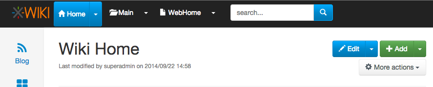
is
be a
> not
> > > > > default
> > > > > > > > also. Maybe we could think of a better solution
if we
were
> > to go
> > > > on
> > > > > > this
> > > > > > > > > path.
> > > > > > > > >
> > > > > > > > > Behavior like double clicking a certain
element will >
hidden
> > > > > > > > interaction for the users. Double clicking is not
a Web
> behavior
> > > and
> > > > > you
> > > > > > > > cannot expect users to know on which links to
simple
click
> vs. on
> > > > > which
> > > > > > > to
> > > > > > > > double click. In the usability testing sessions
users
had a
> > hard
> > > > > > time to
> > > > > > > > > double click on uploading image in the
WYSIWYG popup, I'm
see
> not
> > > sure
> > > > > > > about
> > > > > > > > this approach's success.
> > > > > > > >
> > > > > > > > Regarding the IntelliJ IDEA screenshot, we
already
discuss
> > about
> > > > this
> > > > > > > > idea
> > > > > > > > > and even made a similar proposal some long
time ago, > >
> > > > > >
> > > > >
> > >
>
http://design.xwiki.org/xwiki/bin/view/Improvements/ActionMenuNavigation
> > > > > > > > > Although this proposal is a nice idea and I
would like > > have
> > > > it, I
> > > > > > > > don't
> > > > > > > > > see how this would 'simplify' the
current
implementation.
> > IMO it
> > > > will
> > > > > > > > make
> > > > > > > > > it even more complex and we would certainly
need a
custom
> > menu.
> > > > Also
> > > > > > I
> > > > > > > > see
> > > > > > > > > this as a new feature, than a solution to
our current
> > problem.
> > > > > > > > >
> > > > > > > > > When we implemented the current solution we
discussed
if
the
behavior
> > > > > navigation
> > > > > > > > should be put on the text or on the icon, see
> > > > > > > > http://jira.xwiki.org/browse/XWIKI-10449 . The
main
problem
> is
> > > the
> > > > > > > > findability of this functionality. Users might
never
press
> that
> > > icon
> > > > > > > (this
> > > > > > > > problem applies to the solution brainstorming and
the
> breadcrumb
> > > > > > > proposal).
> > > > > > > >
> > > > > > > > So I think the idea to have an entry with
"Go to ..."
could
> > be a
> > > > > > solution
> > > > > > > > > and to keep the menus interact with the
default > >
> (removing
> > > > > the
> > > > > > > > navigation from the dropdown activator).
> > > > > > > > Removing triangles is not an option. That is a
default
menu
> > > > marker
> > > > > > caret.
> > > > > > > > >
> > > > > > > > > So what are the next steps? We do a issue
with the "Go > > ..."
> > > > > > solution?
> > > > > > > > >
> > > > > > > >
> > > > > > > > http://jira.xwiki.org/browse/XWIKI-11166
> > > > > > > >
> > > > > > > >
> > > > > > > > > Thanks,
> > > > > > > > > Caty
> > > > > > > > >
> > > > > > > > > On Wed, Sep 24, 2014 at 11:55 AM, Guillaume
"Louis-Marie"
> >
> Delhumeau <
> > > > > > > > gdelhumeau(a)xwiki.com> wrote:
> > > > > > > >
> > > > > > > >> Hi.
> > > > > > > >>
> > > > > > > >> I am happy that this topic is coming back.
> > > > > > > >>
> > > > > > > >> 2014-09-24 10:04 GMT+02:00 vincent(a)massol.net
:
> > > > > > > >>
> > > > > > > >> > Hi devs,
> > > > > > > >> >
> > > > > > > >> > I’ve had a few persons tell me that they
don’t like
the
> > small
> > > > > > arrow in
> > > > > > > > >> the
> > > > > > > > >> > top level menu in Flamingo. It
seems they either > >
> understand
> > > > > the
> > > > > > > >> > little triangles and what it’s about
(submenu?) or
they
> > click
> > > > on
> > > > > > the
> > > > > > > > >> menu
> > > > > > > > >> > itself and go to another page when
they were > > some
> > > > menu
> > > > > > to
> > > > > > > > drop
> > > > > > > > >> > down, or...
> > > > > > > > >> >
> > > > > > > > >>
> > > > > > > > >> I don't like it neither. It is not
consistent with
other
> >
> projects
> > > > > (such
> > > > > > > as
> > > > > > > >> JIRA). It is not consistent with what we are
planning
to do
> > > about
> > > > > the UI
> > > > > > > >> language (see:
> > > > > > > >>
> > > > > > > >>
> > > > > > >
> > > > >
> > >
>
> >
> > > > > >> ).
> > > > > > > >> It is harder to use on mobiles, and people
are
surprised by
> > what
> > > > > > occurs
> > > > > > > > >> when they click on it.
> > > > > > > > >>
> > > > > > > > >>
> > > > > > > > >> >
> > > > > > > > >> > In addition we’re still missing a
solution to easily
> > navigate
> > > > the
> > > > > > wiki
> > > > > > > > >> > from any page (there’s the ctrl+G
solution but this > more
> > > like a
> > > > > > > >> shortcut
> > > > > > > >> > to know and we need something more).
> > > > > > > >> >
> > > > > > > >> > So here are some ideas:
> > > > > > > >> >
> > > > > > > >> > * For the top level menu, make it
simpler by having
the
> drop
> > > down
> > > > > > > >> display
> > > > > > > >> > when you click anywhere in the menu (the
whole width
of
> > it)
> > > > and
> > > > > > only
> > > > > > > > >> > navigate when you double click
(there are actually > >
> reasons to
> > > > > need
> > > > > > > >> to
> > > > > > > >> > navigate with the other idea below so we
could also
not
> do the
> > > > > double
> > > > > > > >> click
> > > > > > > >> > thing)
> > > > > > > >> >
> > > > > > > >>
> > > > > > > >> +1
> > > > > > > >>
> > > > > > > >>
> > > > > > > >> >
> > > > > > > >> > * In the breadcrumb OR in the top level
menu OR in
both
> (to be
> > > > > > > decided)
> > > > > > > >> > use something like this (screenshot
taken from
IntelliJ
> IDEA):
> > > > > > > >> >
> > > > > > > >> >
> > > > > > > >>
> > > > > > >
> > > > >
> > >
>
> > > > > > > > >>
>
> > > > > > > > >> > This means when you click at a
given level you get
to
see
> > all
> > > > > > sibling
> > > > > > > > >> > elements in the wiki for element
you’re currently on
> > > > (document,
> > > > > > space,
> > > > > > > > >> > wiki).
> > > > > > > > >> >
> > > > > > > > >> > For example clicking on the “Home”
wiki would show:
> > > > > > > > >> > - A filter box allowing you to type
and it would
auto
>
suggest
> > > as
> > > > > you
> > > > > > > >> type,
> > > > > > > >> > completing with wiki names
> > > > > > > >> > - An icon would be displayed on the left
(or on the
> right) of
> > > the
> > > > > > > filter
> > > > > > > >> > box and if you click on it you’ll go the
index page
(Wiki
> > > Index in
> > > > > > > this
> > > > > > > >> > case)
> > > > > > > >> > - A list of the first 10 wikis (an
improvement would
be to
> > > list
> > > > > first
> > > > > > > >> the
> > > > > > > >> > wiki that you’ve last navigated to)
> > > > > > > >> >
> > > > > > > >> > Same would apply for spaces and pages.
> > > > > > > >> >
> > > > > > > >> > We could even imagine that when you’re
on a user
profile
> > page,
> > > > > > > > clicking
> > > > > > > > >> on
> > > > > > > > >> > it would display other user pages
and the filter >
filter
> > > on
> > > > > user
> > > > > > > >> > pages. Actually we could imagine to when
the current
page
> has
> > > > > XObjects
> > > > > > > >> in
> > > > > > > >> > it, it would be possible to list all
other pages in
the
> wiki
> > > > > having
> > > > > > > the
> > > > > > > >> > same XClass. And if there are several
XObjects, then
> somehow
> > > in
> > > > > the UI
> > > > > > > >> > allow selecting which one to consider as
the filter
> criteria.
> > > > > > > >> >
> > > > > > > >> > * Note 1: The breadcrumb is currently
not displayed
on all
> > > > pages
> > > > > > (it’s
> > > > > > > > >> not
> > > > > > > > >> > on the home page for example) and
thus if we > this
> > > idea
> > > > > in
> > > > > > > the
> > > > > > > >> > breadcrumb only then there’s no solution
for
navigating
> > on the
> > > > > > home
> > > > > > > > >> page.
> > > > > > > > >> >
> > > > > > > > >>
> > > > > > > > >> This is a behaviour that I have put
because I thought > > was not
> > > > > > pretty
> > > > > > > > to
> > > > > > > > >> have a useless breadcrumb on the home
page. It can be
> > changed.
> > > > > > > > >>
> > > > > > > > >>
> > > > > > > > >> >
> > > > > > > > >> > * Note 2: If we were to implement
this idea on the
top
>
level
> > > menu,
> > > > > > > then
> > > > > > > >> we
> > > > > > > >> > still need to display the actions too.
Several
options:
> > > > > > > > >> > - a) Display the actions first and
the navigation > > after
> > > > > > separated
> > > > > > > > >> by
> > > > > > > > >> > a -----
> > > > > > > > >> > - b) Have a first entry in the drop
down that says
> > > > “Actions...”
> > > > > > and
> > > > > > > > when
> > > > > > > > >> > you move the mouse over it a
secondary menu with all
> > actions
> > > > are
> > > > > > > > >> displayed.
> > > > > > > > >> > Note that the alternative is
possible too: Display
the
> > > > actions and
> > > > > > > > have
> > > > > > > > >> a
> > > > > > > > >> > “Go to..." menu entry. We
would just need to choose
to
> > display
> > > > > > what we
> > > > > > > > >> > think is the most used default
(actions or
navigation)
> >
> > > > > >> >
> > > > > > > >>
> > > > > > > >> +1
> > > > > > > >>
> > > > > > > >>
> > > > > > > >> >
> > > > > > > >> > WDYT?
> > > > > > > >> >
> > > > > > > >> > Personally I would do this:
> > > > > > > >> > - implement this idea for the breadcrumb
> > > > > > > >> >
> > > > > > > >>
> > > > > > > >> +0, I need to think more about it
> > > > > > > >>
> > > > > > > >>
> > > > > > > >> > - add “Go to wiki...”, “Go to
space...", “Go to
page..."
> menu
> > > > > entries
> > > > > > > in
> > > > > > > >> > the Wiki/Space/Page top level menus
> > > > > > > >> >
> > > > > > > >>
> > > > > > > >> +1
> > > > > > > >>
> > > > > > > >>
> > > > > > > >> > - expand the menu selection to the whole
width for
> displaying
> > > the
> > > > > drop
> > > > > > > >> > down (and not just above the small
arrow)
> > > > > > > >> >
> > > > > > > >>
> > > > > > > >> +1
> > > > > > > >>
> > > > > > > >>
> > > > > > > >> > - either support double-click or simply
add the
> possibility to
> > > > > > > navigate
> > > > > > > >> to
> > > > > > > >> > that element in the “Go to xxx...”
submenu
> > > > > > > >> >
> > > > > > > >>
> > > > > > > >> +1
> > > > > > > >>
> > > > > > > >>
> > > > > > > >> >
> > > > > > > >> > Thanks
> > > > > > > >> > -Vincent
> > > > > > > >> >
> > > > > > > >> >
> > > > > > > >> >
_______________________________________________
> > > > > > > >> > devs mailing list
> > > > > > > >> > devs(a)xwiki.org
> > > > > > > >> >
http://lists.xwiki.org/mailman/listinfo/devs
> > > > > > > >> >
> > > > > > > >>
> > > > > > > >>
> > > > > > > >>
> > > > > > > >> --
> > > > > > > >> Guillaume Delhumeau (gdelhumeau(a)xwiki.com)
> > > > > > > >> Research & Development Engineer at XWiki
SAS
> > > > > > > >> Committer on the XWiki.org project